I can't wait to see what the next year brings in my weaving adventures!

These are the two treadling patterns I used for the placemats. It's called Jewell and I got the pattern from page 45 in A Handweaver's Pattern Book.


 Marguerite Porter Davison's A Handweaver's Pattern book


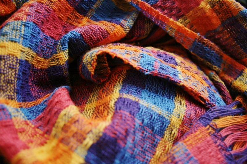
 So I've been pondering my color choices lately for my latest weave and wondering why they look so good together. I don't know a whole lot about color theory, BUT I have picked up a few things along the way.
 It also happens that these two color families are opposites on the color wheel. In fact, if you drew a line between all the colors, it would almost end up in a square shape. That is why I would label these 5 colors as a tetrad harmony. Deb Menz says this about tetrad harmonies, "A tetrad includes four hue families, two pairs of complements that form a rectangle on the twelve-hue color wheel. The relationship of complements is being used, but in a slightly different context. You are working with the complementary relationship and with the relationship between the paris of complements, basically a warm/cool relationship. Yarns using this harmony are more complex than ones that employ only one relationship at a time." (pg 42-43) This fits my colors perfectly: they are working as warm and cool but also within themselves, like the purple and blue look so good together, so does the orange, yellow, and pink. This is so neat!


 The amount of each color is supposed to be random. Now's the time to just let go. Sometimes it was 5 wraps around the warp board, sometimes 2 or 15. Sometimes I just even asked my husband to pick out a random color and number for me!